What a DAM Mess

“Hey, Paul, you and your team know information architecture. Ever work with Adobe Assets?”

That’s how it started, humbly and simply, with a question from a business development lead at my agency. He had been working on a few deals that included Adobe Assets, one of the popular Digital Asset Managers – or DAMs – out in the market. I answered to that colleague, simply, “Not yet, but I’ll look into it.”

Digital Asset Management – also DAM – holds the promise of centralizing all of an organization’s assets… things such as images, content, PDFs, working files, and so forth. It was something that I had a basic familiarity with at the time, but once I learned more, I recognized how powerful a centralized set of assets would be for just about any organization.

While standalone DAMs exist, integration with a broader Content Management System (CMS) or Digital Experience Platform (DXP) is where the real power comes into play. An example of that promise is: I can have an asset that is on a content maintenance cycle, well-tagged, in a folder and place that makes sense in a DAM… that can then be associated with a particular component or template in a CMS… that can be measured for performance in a test-and-learn personalization program, and adjusted accordingly. It’s the end-to-end “Hey, how is this doing?” question that any marketer worth their salt has.

Many DAMs offer significant integration points beyond that (extending this into broader organization workflow management, and existing creative tools) but that’s the gist of it. Organize your stuff, maintain it, and you’re setting yourself up for a bright future of serving up totally personalized experiences to customers on their phones, tablets, computers, watches… you name it.

Well. Maybe.

Where do we put our DAM stuff?

I started working with my team to understand how information architecture (IA) could or should play a role in the DAM work we were selling.

The start of untangling any mess – as information architecture (IA) expert Abby Covert might suggest – is understanding what you’ve got. An inventory and audit, addressing both qualitative and quantitative aspects of content, is the start of so so much work. And in working with DAMs, by delightful coincidence, starting with an inventory and audit makes a ton of sense.

This is where organizations start to get wide-eyed and realize how much of a challenge moving to a new DAM (or simply organizing their assets) can be. When I worked with a large-scale retailer several years ago, we opened a discovery by talking about where they stored their assets today. Great news: they had a shared creative server, internally!

But the creative team also regularly dropped things on their local computers – desktops were full of icons. They also had another shared server for some production assets. And a SharePoint instance where some things lived. And they also used Box for a few things. One marketing team had a totally different process. Yet another department had designed a full lifecycle process built around catalog production that worked well for them, but isolated all of their work from everyone else.

Inefficient? Don’t be so sure. These teams all still produced displays, catalogs, digital ads, 4 websites in 2 languages, and more on a seasonal basis. That’s not trivial work and they got it done, every time.

But they recognized that having a centralized library of all of their work could lead to efficiencies, both in organization and processes around content and asset production. Did they need to have an asset from a photo shoot in 24 different places? No. Did they need to manually create contact sheets in PDFs for approval by creative directors? Also no. Did they need to manually create variations of an asset for display ads, the website, and the mobile website? No!

This is all to say that the way most organizations handle assets today is likely very, very inefficient from a broader enterprise perspective, even when everything happens on deadline and on time.

Enter the IA

That brings me back to the question posed by my colleague. Organizing a DAM is all about figuring out where to put things, how to name things, how to not name things, how to account for modalities, how to support various users’ needs, and almost everything else in a space I typically define as information architecture.

What I’d seen anecdotally at that agency and elsewhere was that developers would handle everything about assets because it was seen as a development task. And while developers absolutely incorporated a degree of IA in their work, it was usually the “best practices” that had been used elsewhere. Anything else around deeply investigating relationships between these pieces of information was left to the client. It felt like a real opportunity.

This isn’t where I’ll say an IA came in and was a superhero and resolved it all. But it’s important to note that with a dedicated information architect involved in the process early on, the shape of the work got a little different.

We started to apply information architecture principles and heuristics to DAMs. In the work my team does now, once we complete the audit, we review it fully with the client in a workshop setting. We talk through how things are organized, any peculiarities, and definitely add in a lot of “nice job on this!” too.

From there we start to analyze their organizational structure and workflows to inform the folder structure. In my experience a DAM is one place where an organization’s structure internally (teams, departments) can make sense for where to put things. But even talking through and reviewing how work gets done in a collaborative, workshop setting is essential.

And while workflows lead into a richer, more governance-related bent of this work, I’ve found that many organizations haven’t taken the time to simply write down, step-by-step, how they do things. These aren’t small companies, either. These are monsters. Big ones. And them seeing things like, “Oh, wow, this gets approvals from 8 people in email” and “Huh, this department puts their stuff here but it really should be there, maybe” is revelatory.

And yes, the development team is naturally involved in this work. They're getting a front row seat to the blueprint for a migration and setup of a DAM.

Ultimately we deliver a full set of recommendations on folder structure, taxonomy, tags, metadata, and naming conventions. We typically include workflow analysis and recommendations too. This culminates in a framework for these teams to take and run with as they look to reorganize, migrate, and implement a new organizational system. Not small work, but important work.

The DAM of the DAM

There’s a slight cautionary tone in my words here, because one other risk I typically see is assigning ownership of the DAM to an already-busy marketing team, an IT team, or a creative team.

I’m not here to tell you if you should reorganize your team but I will say: you absolutely, positively, 100% need to make it someone’s job to be the Digital Asset Manager (DAM) of the DAM. They may be an Asset Librarian, a DesignOps expert, an Information Architect, whatever. Critically that person needs to have knowledge in information architecture. They may “live” in an IT team or marketing team, but having knowledge – at least from a business perspective – of the particular DAM being used is immensely helpful.

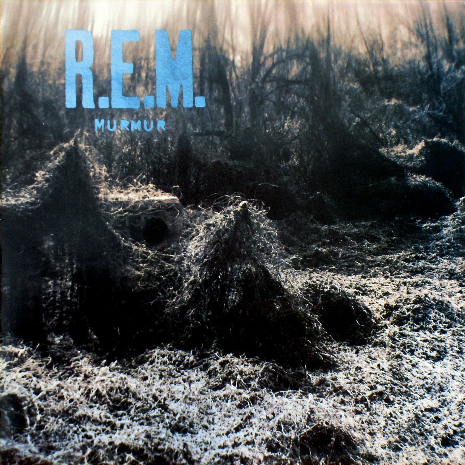
The cover of Murmur. DAM kudzu.

When I’ve worked with clients who have internal DAM owners, things are different. The discussion becomes more about how they can scale and grow a system for a team, and how they can enforce standards. The discussion includes not just the immediate work but what’s around the corner: governance, ownership, and maintenance, critical parts of digital work.

Without DAM owners? Well, you know the cover of R.E.M.’s 1983 Murmur, right? The kudzu? That’s what happens to the DAM. One department organizes things one way, another doesn’t tag anything, and soon you’re back in the same place you started. Not having a person in charge of DAM governance is a pretty bad idea.

Change is DAM Hard

Centralizing your assets is all about change. The way things worked may stay the same, but how things are set up is going to be new. And change is hard. I’m starting to say this more and more: all of this will lead to people being pissed off, upset, or discouraged.

Some people get very attached to their way of working and don’t want to change it. This isn’t something that shows up on a DAM feature scorecard, but you have to honestly and openly evaluate how ready your team is to change. It is absolutely a factor in moving to a different DAM, or any DAM, and absolutely should be considered. I’ve joked that workshops are like therapy but, sometimes, they end up leaning hard in that direction for just this reason. Don’t forget the emotional work, either.

IA is Essential

That simple question that came my way years ago led to a lot of good work with people and teams to figure out how they should better organize their stuff. So when you’re evaluating your DAM – either a current one or shopping for a new one – do not overlook the importance of information architecture. It’s DAM important.

Big Sur Sidebars: Design Critique

Big Sur is designed to frustrate me – I’m convinced of it!

I took a screenshot of multiple apps to compare and contrast. This is a window sidebar, and theoretically should work and look pretty identical. Instead… that is not the case.

Left to right in the screenshot, we have: Mail, Notes, Calendar, Music, Finder, and Reminders. (Reminders is the current window, thus the slight variation in contrast. The lack of contrast in Big Sur remains a disgrace.)

big sur sidebars.png

Here is what I notice.

  • Numbers are treated differently. Sometimes numbers indicating items are in a little bubble, sometimes just text. Sometimes they’re aligned. Sometimes not.

  • Some groups can collapse, some can't. “Library” in Music looks like a collapsable group, but it isn’t. An “Edit” option appears on hover… but despite looking the same as other groups, it isn't.

  • Search is sometimes here, sometimes not. In thinking about it more, the sidebar is the best spot for a search field – having it in the upper right of a window (which happens in a number of apps) breaks the relationship between the search scope and the physical area of the app it is in.

  • Window buttons aren't in the same spot. Incredibly, Calendar fucks this up.

  • Controls in this sidebar are okay sometimes. Calendar, again, fucks this up. Buttons! In the old toolbar! And they only apply to the top area here. Notes adds “New Folder” to the bottom left just because, and Reminders add “New List”. Reminders also has those totally-off big buttons here instead of a damn list. WTH?

  • Notes uses its own font for REASONS. They’re bad ones.

  • Font sizes are different. Reminders and Calendar are smaller.

  • Only Mail has groups within items. Look at “All Drafts”. I can expand that out. Can’t do that in Notes, which has nested items. Why not?

  • All headers for collapsed groups are actionable and don't look that way. Every single header here in every app has some action associated with it, but they only show up on hover – and outside of the aforementioned “Library” in Music, they’re expand/collapse.

Let’s face it: Big Sur is a UI shitshow. It certainly looks like Apple put usability and consistency on the back burner.

Affordances are dead

I miss affordances.

Affordances in computing UIs… are nothing new! When we put words on a screen, we collectively needed to visually convey what one could do with those words. Menus? Buttons? Dropdowns? All of the fundamental UI elements we’ve had for 30+ years started with deliberate design decisions – good or bad – that became standards, or de facto standards.

And as the web and touch interfaces have matured, designers have collectively thrown them out the window. I blame removing underlines on links.

Let me explain, without getting nostalgic.

In the old days of the web, links were underlined and in blue (versus black and no underline for text). It was the standard. Over time, the ability to remove underlines was introduced – so links could be any color and not have an underline. But… how does one convey it’s a link? Some links sprouted icons. Some remained in a different color. Some grew on hover, or showed a background on hover, or did something only when tinkered with.

Even there, the ability to scan a digital thing and convey intent was lost.

But, as with changes, people adapted. We started to click and poke at more things on pages, even things that looked as ordinary as anything else, in the hopes – the hopes – that maybe this thing would make a page or an app do the thing we wanted it to do.

Touch interfaces escalated this change. When using a touch interface, more than ever, the only way to know what one can interact with is through experience. It is less and less conveyed by the UI itself. Thus, it’s shifting the mental burden of figuring out “how do I work this” to the user – fully. Now, it may not be a significant burden! But, a burden nonetheless. The UI no longer says, “This is clickable” or “This is a thing you can interact with” consistently. Sometimes yes, sometimes no. I’ll note: we’ve collectively gotten used to this.

Big Unsure

Like any UI snob, this came home to roost for me when I upgraded my family Mac to Big Sur, the latest macOS. This version has a UI shift that, when rifling through reviews, seems to be noted as significant but manageable. I disagree. Any change will be tough for people including myself, but the other side of that change appears to be… kinda crappy.

Probably the biggest shift is that everything in the OS is button-esque now. Menus are button-y things that open up boxes below them, without a strong visual attachment. Buttons? Are just icons now with no clear indication that they can be clicked, other than the fact that they’re icons. Look at this screenshot from Safari.

Icons? Or buttons? Who the hell knows? (These are… toolbar buttons in Safari.) [Image description: five icons in a row, with no background or border or indicator, from Safari]

Icons? Or buttons? Who the hell knows? (These are… toolbar buttons in Safari.) [Image description: five icons in a row, with no background or border or indicator, from Safari]

I talk a big game about context. The above is out of context but this area in Safari is accurate. Five icons, in a row. No borders. No indicators of what they do. The colors? I believe they’re from third-party extensions, but who knows? And they’re blue because… Reasons, I guess.

There is a ton of guessing one needs to make to understand this. The only thing that helps is prior experience with Safari. There is almost nothing here, plainly, that indicates these are buttons. Who’s to stop a developer from just… putting icons there? That aren’t clickable? And just provide information? Right.

This is just one example, but it’s emblematic of Apple’s continued decision (that kicked off with iOS 7 and Jony Ive’s takeover of the OS… which I also liked at the time) to prioritize visual cleanness over usability.

A menu in Big Sur. Everything is just rounded rectangle buttons now. [Image description: a screen shot of the Finder menu in Big Sur, showing ‘About Finder’ selected with a blue rounded rectangle around it.]

A menu in Big Sur. Everything is just rounded rectangle buttons now. [Image description: a screen shot of the Finder menu in Big Sur, showing ‘About Finder’ selected with a blue rounded rectangle around it.]

Everything is Button, Button is Everything

Here’s a menu from Big Sur, from Finder specifically. Aesthetically? Not terribly different from prior macOS versions. But the button-itis of macOS extends here too: all of these text items are just buttons. The panel itself? Also looks like a big button now. Even the hover in the menu bar… makes it a button. Seriously, Apple, you get rid of buttons on devices and put them all on screen? Is that the deal?

Anyway. Why would you need to buttonize a menu? If you wanted to transplant an iOS interface into a menu, basically – and that’s what Control Center is. A UI train wreck.

Control Center suffers from a crappy visual hierarchy and a design for touch interface that doesn’t translate cleanly to a mouse-based interface. Here, have a look.

Control Center in macOS Big Sur. Someone approved this. [Image description: a screenshot of Control Center in Big Sur, showing multiple rounded rectangle items and controls.]

Control Center in macOS Big Sur. Someone approved this. [Image description: a screenshot of Control Center in Big Sur, showing multiple rounded rectangle items and controls.]

Since day one, Control Center – even on iOS – has been problematic. The great news is that now those problems are on macOS. This makes sense if one has limited space to convey information – then it becomes a real design challenge. But take a moment and look at this. Not everything can be interacted with in the same way. All of these controls, when hovered or clicked on, act differently. So they look somewhat consistent but don’t act that way. How do they work? What do they do? No one knows until they’re clicked on. Some morph into menus. Some are visual panels.

Again, here, the lack of clear affordances means this is a hodgepodge of controls that – honestly? – would be better served by a menu! Nice one, Apple, nice one.

Beyond that? The redesigned dock icons and app icons… are also buttons. No joke. Those shapes you memorized and used to differentiate apps are gone now, with everything surrounded by a rounded rectangle.

The future is dimmer

This is a rant, no doubt. And OSes change – they have forever. But the push that Apple has put in place with Big Sur is wildly unimaginative and short-sighted. How we use computers and computing devices has changed, of course, in the past 40 years! It’s a big difference. But in Big Sur, Apple’s thrown out so much of the UI standardization it helped usher in to computing. Our interfaces today are making us do more work, more figuring things out, and throwing away consistency and adaptability.

It's always infrastructure week

Thanks to Sarah Hopkins for sparking this idea / rambling

So, the election is over. Donald Trump lost.

The bad news? This doesn’t mean “Trump is over”. It really doesn’t. Because this, truly, is just the start. If we want to address the infrastructure and the behind-the-scenes stuff, the inglorious but necessary work, it’s going to take work.

With politics, I will happily admit that the past two presidential elections were the first two I really got involved in (and even that level, to be blunt, was pretty damn limited.) I text banked for a lousy proposition on the Colorado ballot that needed to be defeated, and it was. I texted and called for Hillary in 2016. But that’s been about the level of engagement I’ve had, other than sitting on a pot of outrage for the past four years.

This doesn’t work. And of course, I am going to pull in a parallel from content strategy work.

I talk a big game with clients about training and governance. I’ve heard that governance is not a friendly word, it’s scary, because it carries a lot of weight (and sometimes we head into “processes” land, which I personally dislike but whatever.) I’ve been articulating it this way: when you’re revamping a website or other digital touchpoint, unfortunately, it doesn’t come with a manual. So you’re given a CMS, a DXP, a CDP, and a bunch of other acronyms and told, “Well, good luck! Have a blast.”

And isn’t that how I, and a lot of others, have treated our federal government? We get to the point of a launch, we launch it, we say YAY WE DID IT and then we let it rot. Our content gets old. Our experience doesn’t stay up to date. When we change our values (hopefully for the better), we don’t update anything on the main site because we aren’t sure how or it requires IT or red tape and so we do our own microsite or a half-hearted rebrand or whatever. Because we still need to do the work, and we need to get it out. But our infrastructure hampers us. And then in 2 years we decide, “Well, I guess we need to throw all of this out and start over” and it costs money and time and effort and the emotional labor is just sky high.

And fixing that infrastructure is not exciting work. But it is essential, necessary work.

So, electing Joe Biden and Kamala Harris doesn’t mean we’re good now. We aren’t in a position to throw everything out and start over (although that is incredibly tempting!) Racism didn’t end with Barack Obama. Ignorance didn’t start with Donald Trump. But it’s clear that we need to look at what’s crumbling – and there is a lot! – and fix it before we can move forward.

This is the gap analysis portion of our government work. We’re identifying what we need to update, what needs to be retired, and what we need. And then we need to execute on it. If we don’t, we’re going to be doing this same audit in 18 months, wondering why.

iOS 13: every interaction is heavy

It’s funny, but I’ve been feeling a tiny sense of dread in more of my interactions with my iPhone lately. Upon reflecting on it it boils down to this: every little interaction now has more weight on it.

The best example is contextual menus - evoked with a long press or a press and hold, taking the place of the old 3D touch. The long and short of it is that Apple has driven to consistency with a similar “share sheet” across the OS… but each share sheet takes up more than the height of the screen, is fully customizable, and has a lot of options that make zero sense in context. Like: would I ever want to add a song from Apple Music to Deliveries, the app that tracks UPS/FedEx deliveries for me? Of course not. But I can, because that option is available system-wide.

This makes every interaction I have with Apple Music now carry extra weight. I need to actively search for what’s relevant, and I’m presented with a list of options that simply don’t apply. It’s, in a word, crummy.


Where Do I Go?

A few nights ago I was at an event at a new space, one I had heard great things about. After the event was over I needed to duck into the restroom. I found the restrooms and was confronted with two doors. Both doors had full-sized images of skeletons. One had a black bar over its groin area. One had two black bars, one over its groin area and one over its chest area. There were no words, no other descriptions of which bathroom was which.

I ultimately found my way into a restroom. But it took me more than a moment to interpret the poor attempt at reinforcing binary gender. I mean, all I needed to do was pee, and here was a very specific statement. Considering how new this place was, I was more than a little surprised.

Earlier this year my then-employer moved to a new space that included a gym. The locker rooms had these signs.

Locker room sign: person with box between their legs. (Supposed to be “men”.)

Locker room sign: person with box between their legs. (Supposed to be “men”.)

Locker room sign: slightly narrower person with a mug handle at chest height. (Supposed to be “women”.)

Locker room sign: slightly narrower person with a mug handle at chest height. (Supposed to be “women”.)

Again, these signs were the only ones there. It took me a moment the first time I saw them because I had no idea what was being conveyed (honestly!) But once I saw these, I was a little miffed. I mean, again, I’m just trying to pee here and now I need to figure out a damn puzzle on how this designer decided to reinforce a binary gender.

The big problem with both of these examples is that they reinforce the idea that gender, presentation, and sex are one in the same. The skeleton example tosses in more binary norms on top of it.

These are, in short, horrible ways to “solve” the problem. I’m all for bathroom signage being cutesy and/or clever, but these aren’t – they’re both wrong and offensive.

What’s a better way to do it? Well, being clear with signage is best. Just say what’s inside: a toilet, a urinal, whatever. But if you want to be cute then you could follow the lead of the Great Lakes Coffee Roasting Company in Detroit and do something like this.

Restroom sign. “Stronger flush”.

Restroom sign. “Stronger flush”.

Restroom sign. “Better lighting”.

Restroom sign. “Better lighting”.