The iPad’s been in that unique “not quite a laptop, not a phone” zone since day 1. While we collectively have decided that it’s a tablet and it’s something new, lots of website detection scripts haven’t gotten the memo.
In using the iPad I’ve come across a number of bothersome anti-patterns when simply browsing the web. These aren’t ranked in any way, but they’re sure annoying to me. Some of these apply to the iPhone as well. I’ll try not to rant much.
- Not allowing access to your “full” site. It’s 2011; phones can handle things like CSS and JavaScript now. (Flash? Not so much, but your experience doesn’t hinge fully on Flash, does it?)
- Serving your phone-oriented site to the iPad. While comical and still technically usable, it makes me feel dumb.
- Breaking permalinks due to another anti-pattern. This is a good one. I go to a specific page via Google and somehow end up at your mobile homepage. I can’t get to the actual thing I want to see because you’ve decided, “Ah, this person’s coming in via mobile! Let’s give them the homepage.” No! The “perma” stands for “permanent.”
- Showing an interstitial for your iPad app. If I wanted your iPad app, I would have gone to the App Store. I just want this one page. Your app might not even offer it.
- Displaying a JavaScript prompt telling me you have an app every time I load your page. This, I believe, is a part of some popularly-used forum software. I go to a forum and am told via a modal (!) that an app is available. I tap Cancel and am on my merry way. Then I visit the page and it happens again. Bad! Bad. Bad.
- Not offering the same content between your iPad-geared website and your website. You can (and should!) enhance the content, but what’s offered on your “regular” website should be available via the iPad. C’mon.
- Offering a site in an app wrapper. This is, maybe, a little more controversial but websites aren’t apps. When sites try to do native app things they tend to end up in an uncanny valley. Interactions are off just a little (maybe less responsive?), spinners and things don’t look quite right, and so on.
- An instructions screen. I’m with Khoi. But instructions on a website? Whew.
Examples
Netflix: The good? It’s Netflix. The bad? How am I supposed to know anything about any of these episodes? I can just play them and can’t access individual episode info. Whew.

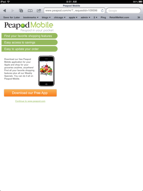
Peapod: This is a pretty standard interstitial. Too bad it’s really for the iPhone (and they have an iPad app!)
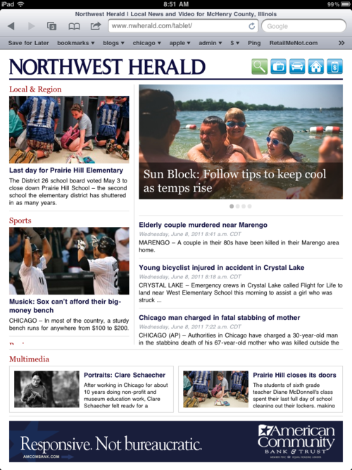
Northwest Herald: My local newspaper offers up a completely different experience for tablets. This in and of itself isn’t bad but, to be honest with you, the first time I saw this I had no idea how to scroll anything. Turns out that it requires the usual scrolling gesture, but the question of what can be scrolled is also a big one. The answer: everything except the ad and top navigation!
Also, they do have a one-time intro/instructions screen that one can never return to.
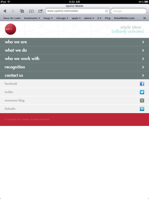
Upshot: While I singled them out, this is pretty standard. It looks goofy and is goofy. Also: no way to get to the full site; for more information, text on the page instructs you to visit their full site on your computer! How 2006.