On Compassion for Others

When it comes to compassion of the self and compassion with other people, for me, it’s been easier to be compassionate with other people than myself.

But something I had first read via Tara Brach said that everybody that you encounter in the day is fully-formed, too. They have their own hopes and dreams and desires and pain and suffering -  they have all of these things, too. And they’re carrying those around with them at that same time you are.

The interaction level with other people may be almost nonexistent. It might be somebody that you see walking down the street as you’re driving by. It might be somebody who’s the cashier at a store. It might be somebody who is asking for money as you walk down the street. But they are full people, too.

I really started to take that in, sit with that and, frankly, just kind of look around at stoplights and look at everybody... it gave me such a different perspective. All these people are just out there living their lives and doing what they need to do or what they have to do or what they want to do.

When I started to see other people as people, that led me to be generally more compassionate and open to the idea of interacting more with strangers - that ties into introversion and social awkwardness, too. I may never understand these people’s pain. I may never hear about it. But acknowledging the fact that it does exist and everybody has it to some degree has that’s been very helpful for me.

This post was excerpted from episode 9 of Designing Yourself, "Embracing the Suffering".

Make small plans

Big plans are exciting. Big plans are breathtaking. Big plans are inspirational. Big plans are motivating. Big plans are thrilling. I love it when a good strategy comes together. But, I also love it when the smallest pieces are just as well-designed.

It's easy to get caught up in only paying attention to the big plans or only paying attention to the small plans. Some people are even told not to do one or the other.

For a very long time, I focused on vague and big plans. I was going to travel, or I was going to organize the entire house, or I was going to plan out family meals for the entire month. While I had components of a trusted system in place, I wasn't fully using it and thus, these big plans were just items on a to do list: too big, too clunky, never going to happen.

Instead I tried a different approach: small plans.

It would be super cool if I organized the entire house. But I know that's not going to happen Saturday, because it would take approximately 394 hours (I estimated!) Instead, "Organize my sock drawer" became something I could easily do. And so I did.

Sure, I said that in jest. But that was actually a nice accomplishment: it was something that had been bothering me. I paid attention to it, and moments later I didn't have to think about it ever ever again.

Those little things add up. Over time, they become the bigger things we want to do or need to do. But if we never make them small, never make them manageable, never make them ours, they may never happen.

There's always one more thing to do

It's no secret that I love lists. I've talked about it on my podcast and I've blogged about it forever. For me, there is something very satisfying for me to accomplish something and cross it off the list - or delete it altogether.

And yet...

In all this talk of making better lists and organizing one's self, one thing is true: the to do list never goes away. It never ends.

I don't see this as a fatalist thing, or a depressing thing. And, in fact, there was a time in my life when I felt so very overwhelmed and burdened by things to do that I prioritized them over everything else. Everything else. I could always find busywork in cleaning, or organizing, or doing project X that had been on the back burner forever.

I could also be distracted by tools: trying a system out (Things, OmniFocus, GTD) and then letting the tool be the focus instead of the things to do, or not do.

But in the meantime, I realized that choosing to do something on my list meant I wasn't doing something else. The list would live forever, and it would always be there. And as I sat with that I came to see that the list couldn't be my life anymore. So I worked on doing something very difficult: I started to let the list go.

That led to initial feelings of guilt ("Oh no! I'm not organizing the garage today EITHER!") and regret. Those feelings subsided over time to a place of acceptance, because it helped me refocus on the choices I was making at the time. Yes, I wasn't reorganizing the garage. But what was I doing instead? Something that was more important.

The to do list is never going away. You can recognize that and dive completely into the list forever and ever, never finishing, always busy. You can also recognize it and choose to live your life, and not let a list rule you.

FOMO

Yesterday I posted a simple tweet saying, "FOMO." You know, fear of missing out. 

It was a gut reaction to what seemed to be happening in everyone else's lives: fun things. Adventures. New opportunities. New kids. It felt a little weird to me, very uncomfortable, and right away a part of me brought up this invisible scorecard I have... and I wasn't "winning" (whatever that  means). Whatever I was doing with my life, in that moment, wasn't "enough".

Here's the thing: it's not true! Not at all. And I bet it isn't true for anyone reading this. Ups and downs happen, and they're as natural as the way water ebbs and flows. But we can strive to be mindful of these down moments, explore them, stand inside of them, and then take action on them.

When I really sat with my FOMO, a new fear spoke up: the fear of missing out on my own life. I was able to meditate on that very briefly and feel it: while present in my mind, it didn't ring true. I'm being myself, and still practicing being myself in each moment. Not fear - presence.

Presence is the opposite of missing out. It's being in

Replay

There are events in my life I replay in my head at a moment's notice. Sometimes it's  great stuff, like my wedding day or the day I met my son, and the way I feel when I'm replaying those moments is hard to articulate - but I feel warm, comfortable, confident. 

Then there's the shitty stuff. My brain is filled with memories of embarrassing and sad situations from my life too. Sometimes I replay these and until recently, I never tried to do anything with them. I just watched them play. I'd be in the car, and think about something that happened in 2nd grade, and it would just be overwhelming . Not to the point of pulling over, but something that would absolutely take my energy right out of the present. Haunted me.

But there's something I realized recently and shared:

Expanding on that a bit: the way that I've seen these memories in my head is like I'm watching TV. It's me on the screen, I can see it, but I can't interact with it.

And then I was taught that I can, in fact, interact with it. While I can no longer change what happened - ever - I can always change my relationship in the present with that memory. So the things that I've held with me, the things I deem embarrassing, are chances for me to step in with who I am now and react differently. 

Because I'm a geek I like to compare this to time travel. I can go anyplace in the past, and I can't change the events, but I can interact with what's happening knowing that - to quote Faraday from LOST - whatever happened, happened. 

So what's in the interaction? Usually me trying to be more compassionate with myself, honestly. Not being so hard on myself or, if I am hard on myself, accepting that and trying to understand why that is.  In contrast, I relive the good stuff to just feel good in a moment. Sometimes I need that comfort.

All that said, this idea has significantly changed the way I think about the past. I respect it. The script is written. But I can reinterpret it now, and I bet I'll reinterpret it differently in 5 years, 5 decades (hopefully!), or even 5 minutes. We're always changing, always. 

Agile really is wrong for UX... strategy

I've heard lots of misconceptions about the work of design over the years. I bet you have too.

"Design takes time and can't be estimated."
"Design is slow."
"Design makes things pretty."
"Design doesn't need to be tested." 

These misconceptions place design in the realm of magic, as if it can not be measured (it can) nor estimated (it can). The term "design" also may be relegated to the visual design profession - as if to say that visual design is easy.

In part due to the popularity of Agile and the fact that it was designed for software development ill-informed teams may view design as a bottleneck, a special snowflake, or an activity unrelated to development. This may be predicated on the notion that only certain people can design things.

Design is only a bottleneck if you make it that way through organizational structure, ignorance, or both.

Agile can both help and hurt

One proposed remedy to a perceived lengthy design process? Agile. The Agile framework has amassed a reputation for speed. (Ideally that reputation would include other things, but this is primarily what I've witnessed.) Now, Lis Hubert's article is right in the broad UX sense - designing a product, service, or what-have-you at a strategic and enterprise level is not well-suited to 2-week sprints. It's kind of silly to think it is. But Agile isn't about creating an entire product in a sprint; Agile is about shipping something. That should resonate with UX folks because we want to get something out there to get user feedback on (right?) Thus, we work alongside development in the same team to deliver something. Yep, pair developers and designers.

The important piece of UX in Agile is that it makes things transparent. Some design work does take time, but instead of a nebulous "whenever designers finish their work..." mentality, there are numbers on it. What would happen if a company never estimated development work? Yeah, I doubt that'd be good.

Make no mistake: Agile UX is about delivery. Research and similar activities can absolutely be done in this framework, but - this is key - the scale and scope will be markedly smaller. It is possible to take learnings from small research and scale them up to something bigger... say, a UX strategy!

If UX strategy is implemented at this scale, I doubt Agile UX by itself can address it well.

Agile UX is wrong for UX vision and strategy

UX strategy, I believe, sits above this. Learnings and work done within Agile teams and sprints roll up to a broader set of goals aligned to KPIs. (Note: you can't do this work if design is seen as an exercise in magic, because then it is seen as without value.) This strategy may be expressed in maps of how design components, patterns, and practices contribute to the bottom line (or top line, or....) It requires a dose of advocacy and education. This all is a key part of the work of a UX strategist.

Admittedly this part of design is a little slower because it's integrated with business models, technical architecture, and product portfolio definition. It's not quite "big design up front", but it is necessary to ensure there will be experience-related goals in mind during the overall delivery process.

This portion of the work can also be built on your standards: branding, interaction, UI, visual design. This can make the overall creation of assets and design work a lot faster.

Coupling

A last note: I firmly believe that design and development should be coupled as closely as possible at both strategic and delivery levels. Companies tend to get the UX + delivery part right faster because of the classic "UX is deliverables!" problem. It's different when strategy is in play, because in some companies the value of design at that level may or may not be realized. This is the fabled seat at the table... but it doesn't just materialize because we want it.

Through creating value and tying it to what matters to the business, UX and design can lead those conversations. But it's not going to happen when your designers are solely tasked with delivery.
Do what is right

Something doesn't work. It's broken, badly. You know why it's broken. You might even know how to fix it. 

But it's hard. It's going to take a lot of time. It might take a lot of money too. And people... it might take a lot of people, more people than you've got. 

It would be very easy to let it be broken and let it go. But it matters to you. You give a crap.

Letting it remain broken and ignoring it or just getting rid of it... that would be very simple and would take no time. Almost no effort. About 3 cents. And just you.

So do you do what is right, or do you do what is simplest? 


One big thing

One piece of advice I've taken to heart is to do one small thing in a day - something for someone else, something for yourself - but the act of doing it, accompanied with the idea that it's "small", tends to be enough motivation for me to go ahead and do it. 

But what about doing one big  thing today? Something that has a big impact, however you want to define it. Something that isn't small - something ambitious. Something that comes from a place of love, not fear.

"Make no little plans. They have no magic to stir men's blood and probably will not themselves be realized." - Daniel Burnham


Keynote is a kick-ass prototyping tool

Note: This piece was written in 2013, before Keynote got a massive update to match its iOS counterparts. The feature set has changed and, thus, it may no longer support a lot of these awesome features. Wah wah wahhhh....

The idea of using Apple Keynote for prototyping is not new. In fact, it's really really  not new. But I recently decided to give it a shot again and found it to be pretty damned good for this purpose.

The Problem

People love high-fidelity. Low-fi stuff is good for basic flows and page structures, but when it comes time to check out the nitty gritty nothing beats hi-fi: it simply feels more real. I wanted to get ideas in front of users quickly, and also make changes just as quickly, but I didn't want to break out the HTML. Enter Keynote. 

The Good Stuff

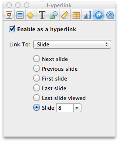
Keynote provides the tools for a rather robust prototype. First, it supports hyperlinks: any object (text box, shape, etc.) can jump to another slide, a mailto:, a web page. Easy.

Keynote hyperlinks.png

I often take a screenshot of an existing UI and put totally invisible shapes on top of it. Just grab a round rect or a square, plop it on top of the UI element you want to activate, kill the fill color and outline, and make it a hyperlink. Easy.

Keynote also supports animations on slide load/unload and, unsurprisingly, those animations are also supported - for the most part - by Safari and better modern JavaScript + CSS libraries. So, you can have interactions mocked out. Also easy.

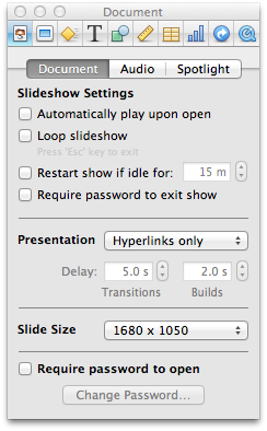
Someone anticipated this type of usage for Keynote, as you can make a non-slideshow and force a user to interact with your prototype. Just change the Presentation type to "Hyperlinks only" in the document inspector. 

Keynote hyperlinks only.png

Again, easy. Really.

What's also great is that a file can be exported as a PDF or as a Keynote file. Now, you might wonder why the hell you'd want to make a PDF out of this thing, right? Here's why: while you lose the animations, you keep the hyperlinks. So, you've just made a Q&D clickable prototype that works just about anywhere! We've used the PDF prototypes on laptops and iPads (with apps like iBooks, GoodReader, etc.) 

Also: Keynote's image editing tools are the OS X standard ones, which means you can actually adjust images. PowerPoint, I'm looking at you in disgust.

The Not as Good Stuff

The hyperlinking capabilities you see above are pretty limited. You can't do too much amazing stuff.

Keynote also sticks hard to the slide metaphor (it's a presentation tool too, remember) so you still have the construct of "pages" to worry about. But duplicating slides makes this kind of a non-issue. At one point I admit I did  have two slides to indicate on/off state of a checkbox. Inefficient? Sure. But I needed to test that part of the UI.

Viewing a hi-fi Keynote presentation with animations et al intact requires a Keynote viewer, which means the Keynote app on iOS. I'm not sure if the new web-based Keynote (announced in June 2013 at Apple's WWDC) will handle this, but if it does... look out, because PDFs may no longer be required. 

What is this all good for?

Keynote isn't where I'd want to build something super elaborate and complex. It is the place where I want to get out pretty high-level UI ideas, but with a degree of polish I simply can't do otherwise without re-learning Photoshop. Being able to link slides and create a fair amount of interactivity makes it feel more "real". And, the speed - the speed! Keynote is super fast for these purposes, and it moves about as quickly as I need and want it to. I don't need to learn another language nor UI for it. 

Tell you what. If you have it, try it. Go grab some templates from Keynotopia or just build off of your existing screens. Don't dismiss it as a lowly presentation tool: Keynote is a utility that should be in your UX toolkit.

Sketching with users

One of the most powerful things I've done in product design is collaborative sketching with users. It gave me some great ideas to take back to the team and helped validate some existing ideas. They're a great companion to design charrettes with internal stakeholders.

How It Happened 

The product in question - a store for purchasing media and a light media management piece - was undergoing a redesign, and a potentially large one, so there were a number of steps I took to get to the heart of the problem: 

  1. Good old fashioned stakeholder interviews;
  2. Hour-long conversations with representative users; 
  3. Persona creation (tasks, beliefs, attitudes) based on those conversations; 
  4. Collab sketching with users; 
  5. Mapping persona tasks to specific steps in the overall journey.

The conversations with users were based on indi young's work. This product was based on watching media (TV shows, movies...) so my questions were focused mostly on the purchasing and watching side. But I needed to first understand how and where and why people watch TV shows and movies, so I started there.

Conversations

I used our recruiting firm (with a pretty standard screening process) to get people who met the key customer demographics for the products. I recorded all of the Skype calls with Piezo, and then used Mechanical Turk to create transcripts.

The beauty of this is that I then had more  representative people to design for, versus abstract demographics. I don't know about you, but I prefer designing for Bill (who loves movies and enjoys watching them on his comfortable couch over some freshly popped popcorn) over designing for an abstract (a single Hispanic male in the 35-54 age range with no children, 2 cars, and an annual household income of $125,000.)

Now, with those personas in mind I leaned on our recruiting firm to bring people into our office. In the interim I had created some barebones paper prototypes using OmniGraffle, which would represent the highest level flows and some of the finer interactions on screen. I also created the tasks ("Rent a movie." "Tell me who stars in Good Will Hunting .") we would use during our time together.

I don't know. Why don't you draw it?

The fun part was this: once we were in the tasks together this common exchange came up, but this time I added a twist:

User: "Is it supposed to do that?"
Me: "I don't know. What do you think it should do? Here, take this Sharpie and paper and show me ."

Now, you know that some people react with, "I can't draw!" or more precisely, "I claim I don't know how to think visually because I fear that it requires some sort of title with 'design' or 'artist' in it and I don't have that but help me here and please don't judge me okay because it looks like you have those skills!" So it was my responsibility to help those people through the process, guiding them and sketching on another piece of paper right next to them. It wasn't to upstage their ideas, but to help them feel comfortable and willing.

When someone got stuck in a task I let them start the discussion with a sketch but then I'd try to mimic it back, much like I do in a conversation. ("It sounds like you said this ...") This gave the collaborator the power to correct me if I was wrong, which was key - I might have totally been wrong. We also got to build off of ideas this way.

The space we created together also allowed people to provide ideas for product features. It wasn't too focus group-y; it was organic from the sketches created. One person suggested we sell ancillary merchandise related to media... like a T-shirt to go along with a movie. Nice idea, and our product manager ultimately put it on a backlog and considered it. 

The feedback I received from the participants was awesome. One person even said it was fun - mission accomplished!

After those sessions, I reviewed the video recordings and watched for specific trouble spots in the flows and interactions, just like any usability test, and noted them. I also noted the opportunity areas in sketching, and included them in a presentation given to the product and creative teams.

 Drawing with people really is fun 

By providing a safe and comfortable sketching environment as a part of my research, I was able to quickly see some trouble spots in my design and get some great ideas to boot.